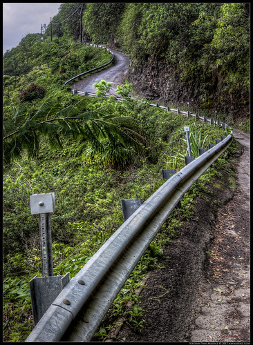
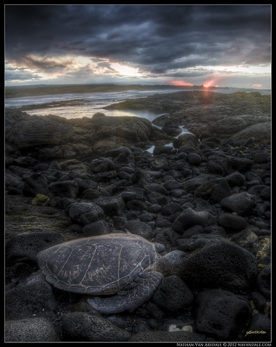
I took this image on my way back up. The cloud-covered late afternoon light provided nice soft shadows. And the lovely "S" curve of the guardrail gave me a nice excuse to pause and catch my breath. It should be noted that the horizon line is at about the third support for the guardrail. I captured this at f11 to give a sense of the length vs height of the road ahead.
This is a Vertorama created from 3-horizontal HDR frames using Photoshop CS4. Each frame was created from 3-RAW images using Photomatix Pro.
The "S" Curve
Part of what excites me about doing what I do is experiencing the music of nature. That is why I will almost never include man-made objects in my images, unless they completely compliment the landscape. This rugged, steep road and blue-steel guardrail certainly added a since of balance and respect for nature against the lush forest backdrop. I have so much respect for the people that built and maintain this stretch of road. (Honestly I have loads of respect for most people who build most things! I just find natural landscapes to be more pleasing photographic subjects).
I started noticing a few years ago how most of my better landscape images all exhibited a common compositional feature... the "S" curve. I find this curve incredibly pleasing! It is feminine, strong, organic, and powerful, and allows the eye to easily wander across the scene. Often times I see S curves over the field of a large scene with a really up-close foreground, which is why many of my images are panoramas or vertoramas. The beautiful thing about finding the "S" curve is that it immediately creates a balance... a yin-yang effect, if you will. Just know, sometimes the S is more implied than others... but that's where we get into composition.


If You're already familiar with the Golden Ratio and Rule of Thirds, you can skip this section.
 |
| Rule of Thirds |
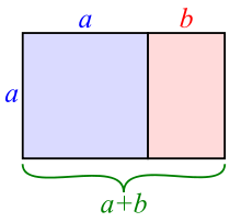
But let's start from the beginning. Basic photographic composition requires knowledge of the golden ratio, or so-called "rule of thirds". The golden ratio is present in all life, down to our very DNA. It is predictable, fractal, simple and complex. By recognizing the balance in a scene--often times we are recognizing mathematical relationships between objects of matter, light/dark, and/or color--we are recognizing the golden ratio. The thing is, we are not always aware that that's what we're recognizing. And thus, often times when we pull over to the side of the road to photograph something pretty... pull out our camera phones for a quick snapshot... or even take the time to go hiking with a tripod, we get images that are lacking in some way. That's when we say, "Well, the image doesn't do it justice"...or..."well, you really had to be there." By learning to look for this golden ratio, every image you take will be better!
 |
| The golden ratio. |
 |
| DaVinci: Vitruvian Man |
Here's a VERY unartistic, boring, mathematical look at a few combinations of the golden ration one can employ while composing an image (note, these are just a few combinations). You can begin to see how combinations of this nautilus pattern will create "S" curves.


 Here's the idea put to the test. This is an image I took a couple of years ago while hiking to Coyote Buttes (The Waves) in between Arizona and Utah. Because this is a reflective landscape, it should already be symmetrical.
In order to obtain this image, I rested my camera about an inch off the ground, and focused on the reflection in the water, rather than on the physical peaks of the ancient dunes (although the dunes are compositionally the focal point). The other aspects of the image that I wanted to include are the bush, the two peaks to the left, and the frame of clouds. Clouds are SO important when capturing landscapes. Empty blue skies are just boring, and considered dead space. You will NEVER see a professional landscape painting without an interesting sky.
You'll notice that this image leads the eye from the peaks of the dunes either up to the sky, or down to the water (both following the arch of the clouds), and then finishes at the twin peaks and the bush. This scene is well balanced from the foreground to the background; the curve of the golden mean leads the eye comfortably around the image, and is thus "pleasing to the eye."
Here's another one of my older images. This one was taken in Green Mountain Falls, Colorado about 4 years ago... before I really began to study composition. This is one of those scenes that you walk by and can't help but be struck by its beauty. The mix of autumn colors with silky water and frosty ice make for a beautiful image. I feel like it's pretty easy to see gentle nautilus curve of the golden ratio in this image... but just in case, I went ahead and overlayed the nautilus. My focal plane includes the frosty tree and patch of moss on the right side of the image. In this case you'll notice both how the golden mean is important in composing depth within an image, and how the lines of the nautilus curve and the rule of thirds can serve to frame internal aspects of the scene.
 |
| See how the different sections of the overlay correspond to individual scenes within the scene |
 |
| "Hazy Shade of Winter" Green Mountain Falls, CO |
In both sets of images straight, diagonal lines create a sense of movement through the image, leading the eye from one node to another. You'll notice how in both cases the diagonal lines also coincide nicely with the arch of the nautilus curve.
Earlier I mentioned that the golden ratio is both simple and complex. It's easy enough to see how simple it is on a 2 dimensional plane. But nature is NOT 2-D! The golden ratio is present in everything, everywhere, all at once... and everything is ALWAYS changing... Super complex!!! Recognizing the pattern often just requires a shift of perspective, a different focal-length, a different lens (Don't bring the camera up to your eye... bring your camera into the scene, then bring your eye to the camera).
 To compose with the golden mean, usually finding a diagonal line that leads from one interesting area of the scene to another, and spans the length of the frame (at least implicitly), will do the trick. That diagonal line will help lead your eye from the main point of interest (which will usually be an extreme foreground object and focal point), to the secondary point of interest further in the background. You'll notice that most of my images have a focal object that is roughly equidistant from the edge of the frame to the edge of the diagonal. Keeping the focal object away from the edge of the frame, and away from the center of the frame (rule of thirds) will heighten your chances of creating a dynamically composed landscape image. This busy overlay shows how there are many leading lines of composition, and that each focal point in the scene begins a new nautilus curve that leads the eye to the next focal point, and then back again. The shiny, metallic reflector on the lower left invites the eye to examine the metal guardrail, which leads up the leafy, cracked road to the next reflector. The eye is then lead up to the top of the road to the power lines, and then descends down towards the large fern branch, which pours the eye back into the beginning of the scene.
 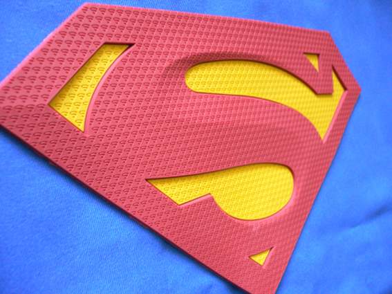 |
| The "S" curve |
The "S" Curve Continued
That brings me to the "S" curve (finally). Having an object, or a series of objects, create an "S" shape (often similar to Superman's Emblem) will automatically make your photograph conform to the "math of beauty" without you needing to actually do any math. I don't think it's necessary to look solely for an "S" curve while out in the field, because that would be incredibly limiting. But, it IS necessary to look for balance while composing a photograph. Don't let the term "S" curve confuse you either... not always will the curve look exactly like the letter "S!" Often times the curve is implied from the relationships of other compositional variables (i.e. foreground object, mid-ground object, background object, areas of light vs. dark, etc), and is in the shape of a question mark, or W, rather than an S. The "S" is not necessarily a 2 dimensional (x and y axis) shape, but conversely often reaches from the front to the back of the scene along the z axis, leading the eye around the image.
Thanks for reading. This concludes part 3 of my three-part series Travel, Magic, and the Letter "S." If any of the concepts I discuss are confusing or new, please visit previous posts for clarification, or feel free to drop me an e-mail :-)
If you like my work, please consider either donating or purchasing one of my fine art prints. Just head over to http://nvaphoto.smugmug.com/, and enter the code BlueMoon to receive a 50% discount on all print orders over $25. The Offer ends at the end of the Month!
If you like my work, please consider either donating or purchasing one of my fine art prints. Just head over to http://nvaphoto.smugmug.com/, and enter the code BlueMoon to receive a 50% discount on all print orders over $25. The Offer ends at the end of the Month!
If you'd like to suggest a topic for me to write about, I'd love to hear from you... just leave a comment below.
All the best! Be Well! :-)


